Bathroom
Luxury Bathroom Finishes Guide
Luxury bathrooms often feel effortless, but they’re anything but accidental.
The materials are familiar, the palettes are restrained, and the details are considered just enough to feel special without trying too hard. When it works, everything feels balanced and calm.
We’ll share an inside look into the finishes and design moves that consistently create that effect, and how they’re used in high-end bathrooms that hold up over time.
Key Notes
Marble feels timeless when calm surfaces are paired with expressive detail moments.
Polished nickel and brass control light and age best when finishes are chosen intentionally.
Exposed pipe showers succeed through alignment, symmetry, and clean wall detailing.
Tile scale, layout, and grout choice shape how luxury bathrooms feel and age.
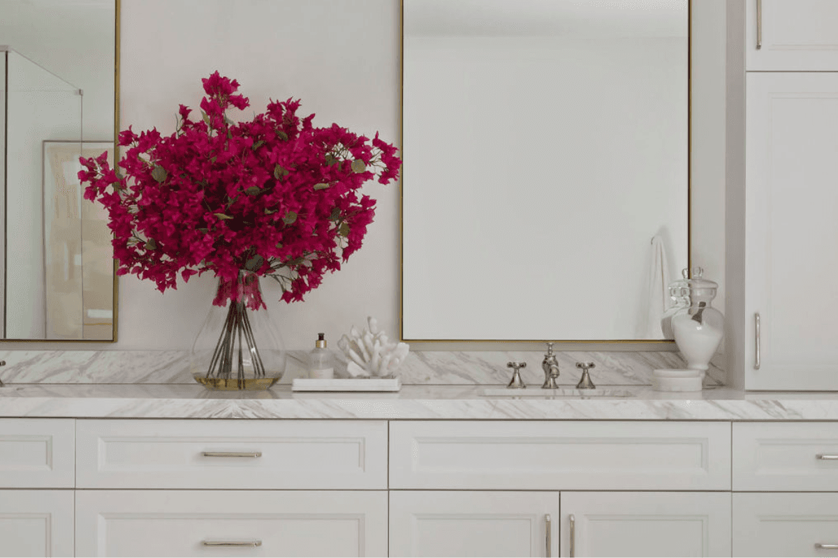
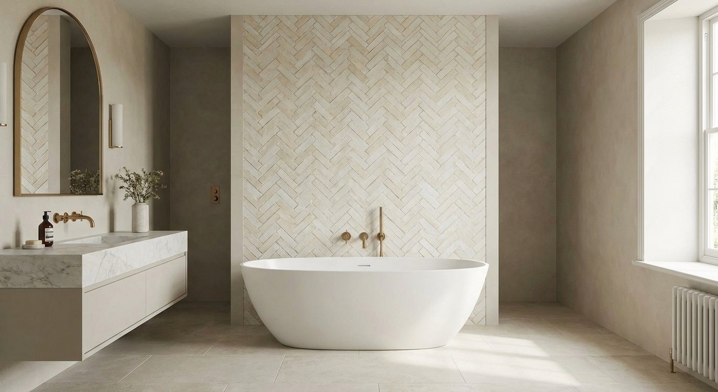
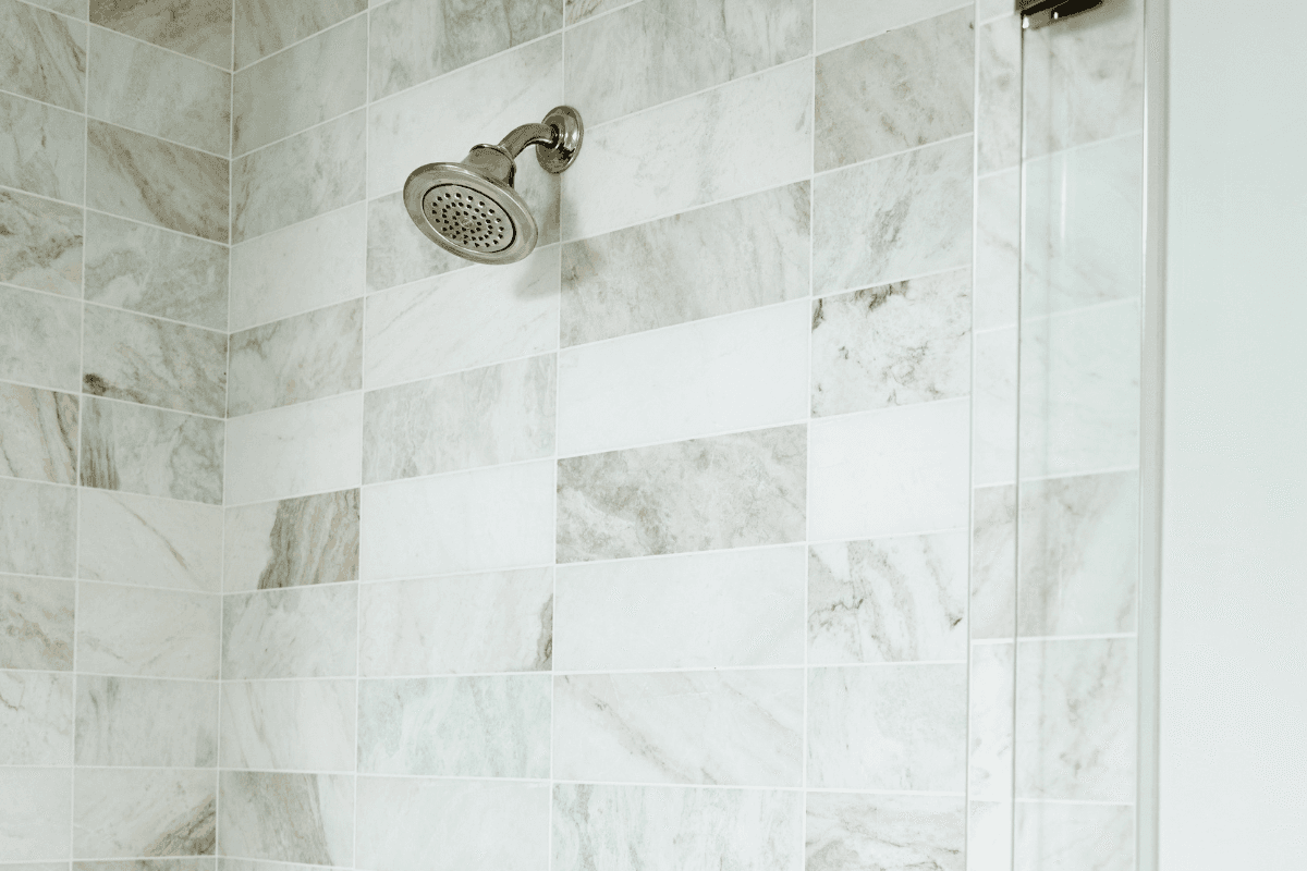
Marble Details
Marble feels timeless in bathrooms for a reason – it connects centuries of ritual bathing with a look that still reads clean and modern. In this one room, its physical qualities and cultural association line up unusually well.
Why Marble Reads Timeless In A Bath
It Has History In The Right Place
Marble has shown up in bathing spaces since Roman and Turkish baths, so it’s visually coded as “appropriate” for water, steam, and cleansing. That long, continuous use makes it feel classic, not trendy.
It Plays Well With Almost Any Style
Bathrooms are full of hard, simple shapes: basins, tubs, slabs, tile fields. Marble veining adds a little organic movement without fighting the geometry. It also pairs with ornate brass as easily as it does with minimal nickel, which is why it sits outside fashion cycles.
It Brightens & Cleans Up The Read Of The Room
Pale stone and a subtle sheen bounce light around enclosed spaces.
On top of that, our brains associate marble with hotels and spas. Whether we admit it or not, it signals “this is meant to feel good.”
It Makes Material Sense
In a wet room, stone feels honest. It handles humidity and heat better than paint or laminate, and it feels permanent. That appropriateness is part of why it reads as timeless.
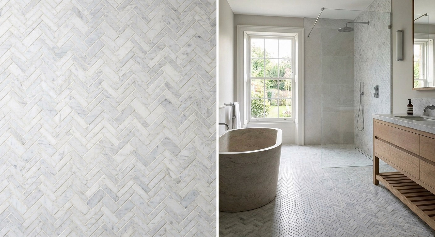
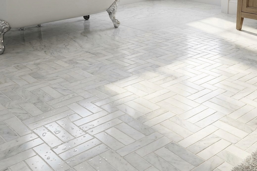
Surface Marble vs Detail Marble
Designers sometimes talk about “surface marble” and “detail marble.” It’s not two different materials. It’s two different roles.
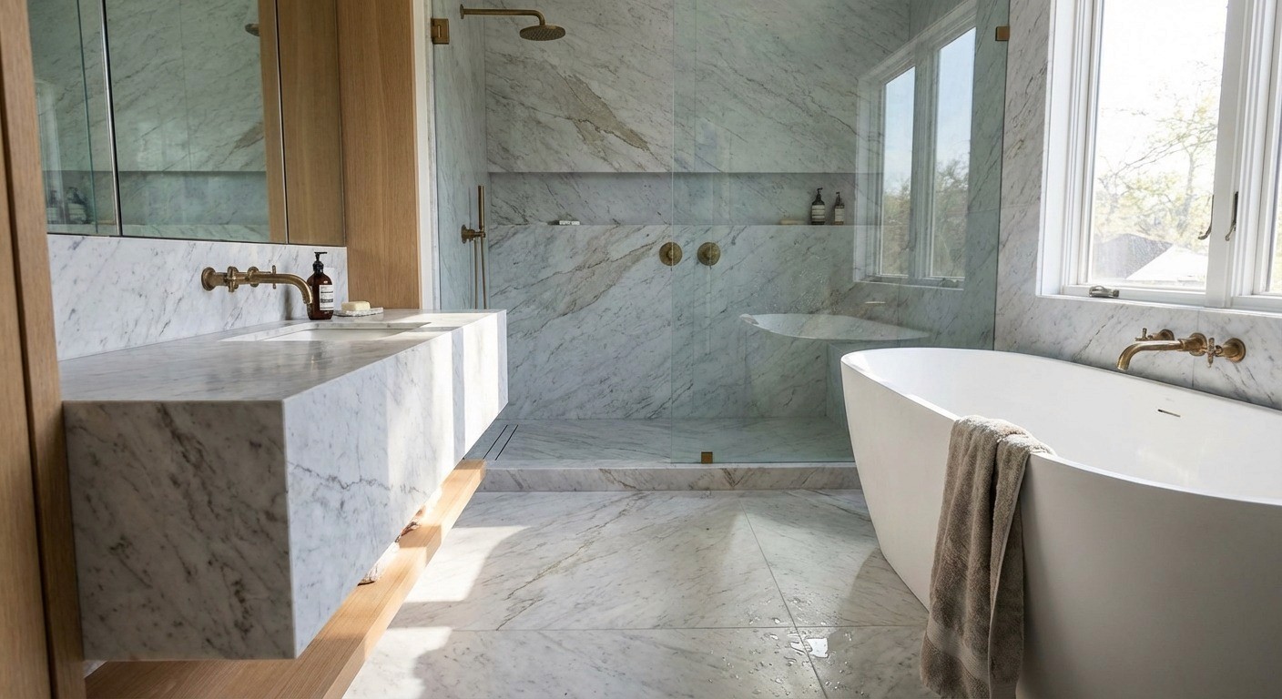
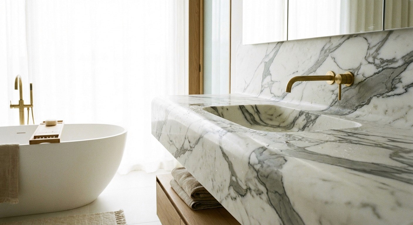
Surface marble is the big, continuous background. Full-height shower walls, large-format floors, long vanity tops, slab cladding. This is where you care about overall tone, veining scale, and how coherent it looks from across the room.
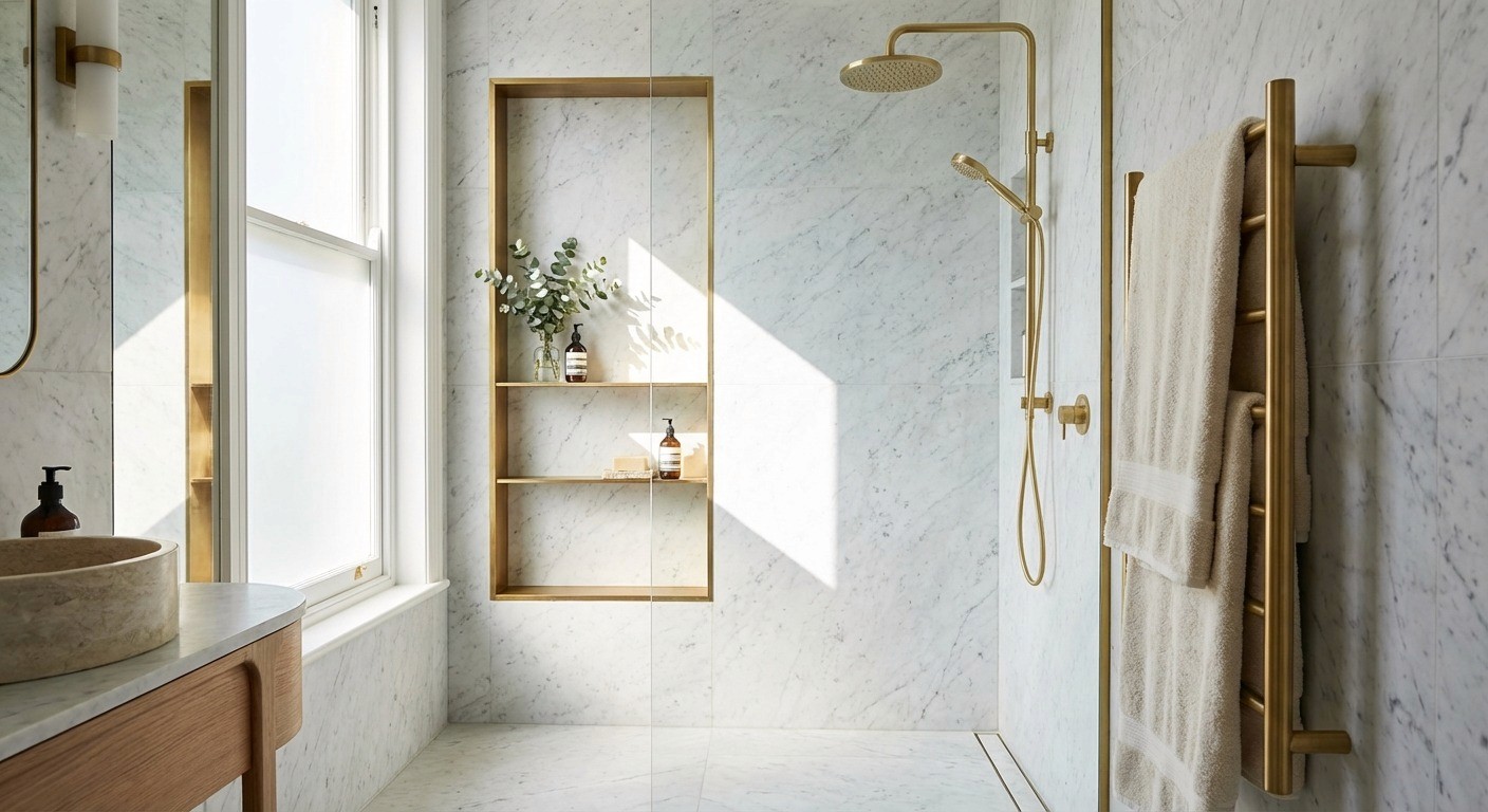
Detail marble is the smaller, intentional hit. A trim, an inlay, a threshold, a framed niche, a vanity edge profile, a small mosaic. Here, character matters more, because you’re seeing it up close.
A simple rule that holds up: keep surfaces calm enough to live with every day, and let details be the jewelry. That contrast is what makes a marble bathroom feel layered instead of busy.
Why Small Marble Moments Often Look More Expensive
There’s a certain confidence to using marble sparingly. A veined shelf. A framed niche. A delicate baseboard. One threshold that makes you feel like you’re “stepping into” the wet zone.
That scarcity creates hierarchy. Marble punctuates the room instead of dominating it, which keeps the whole space edited. And because these detail moments don’t fight future changes, they age well. Swap out hardware later, change the paint, add different lighting, and that thin liner still looks intentional.
Common Marble Types In Bathrooms
Most of the difference is background color, veining character, and cost.
Carrara
Light grey to grey-white with soft, feathery veining. It’s typically the most approachable price point and works beautifully for larger coverage because it stays quiet.
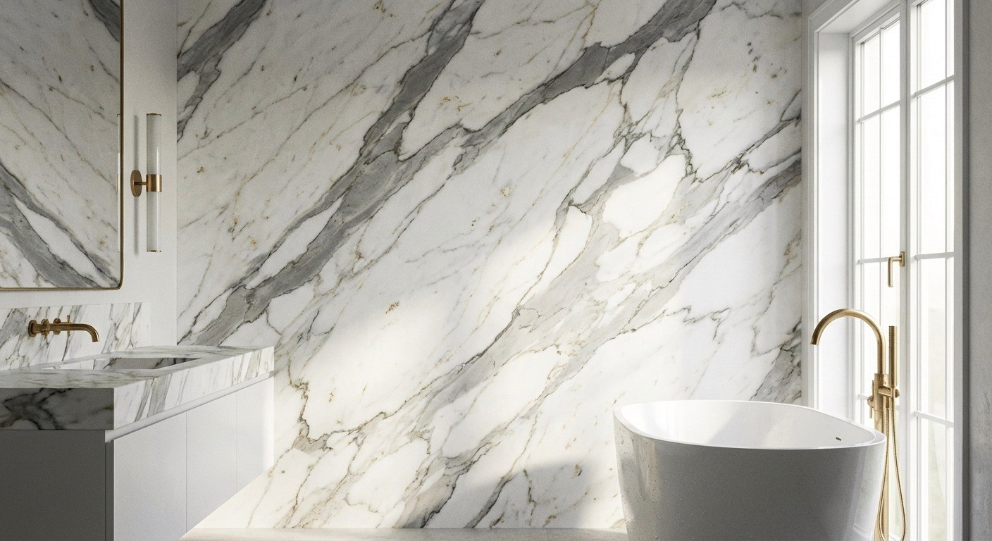
Calacatta
Brighter white background with thicker, more dramatic veining, often with grey and sometimes gold or brown tones. This is the “statement” marble and usually comes at a higher price.
Statuario
Rarer, often more expensive, and typically very bright white with striking veining that can read refined and sculptural. It’s a showpiece stone.
If you’re matching the vibe:
Carrara feels misty and relaxed.
Calacatta feels high-contrast and expressive.
Statuario feels crisp and gallery-like.
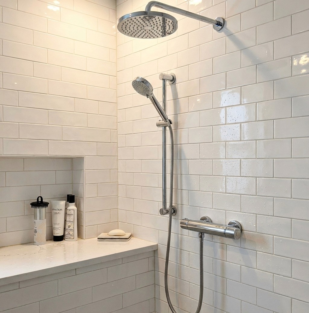
Marble Detail Moments We Love
These are the small, high-touch, or highly visible elements that add quiet luxury without turning the entire bathroom into a stone showroom:
Pencil liners, chair rails, bullnose trims framing simple field tile
Thresholds at doorways and shower entries
Framed niches or mirror surrounds
Shower benches, ledges, and window sills
Vanity backsplashes and side splashes (instead of full slab everywhere)
Integrated soap shelves or shaving ledges carved from offcuts
Inlay borders, perimeter bands, “rug effect” mosaics under the vanity
Decorative caps on half walls and tub surrounds
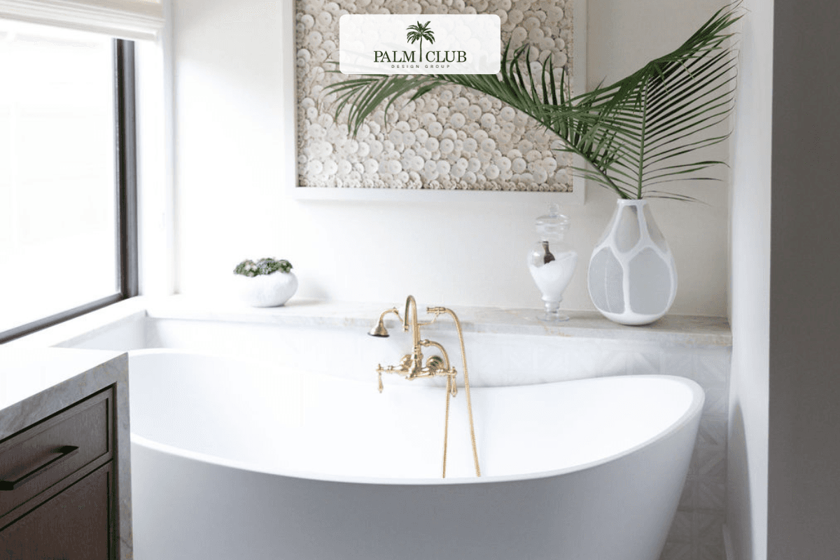
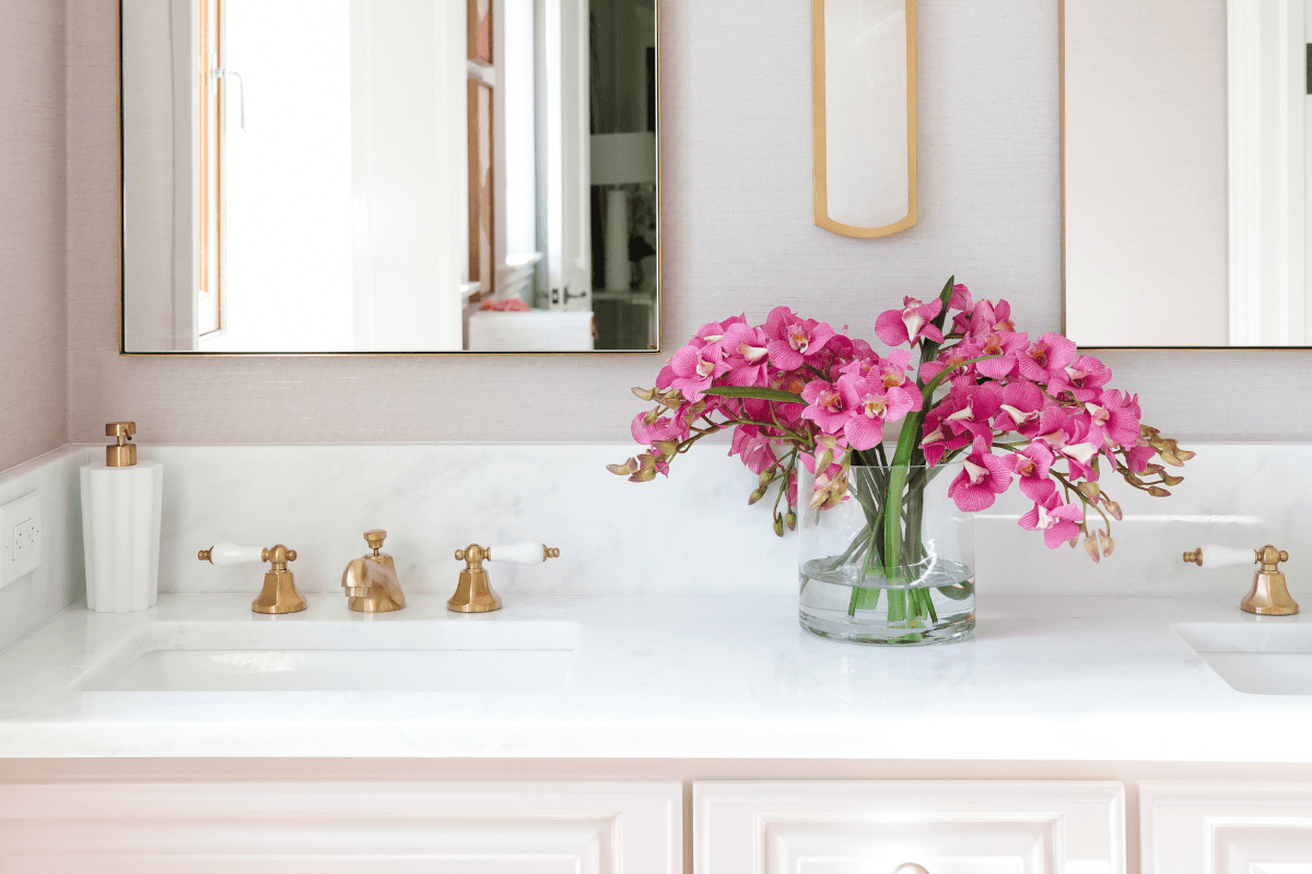
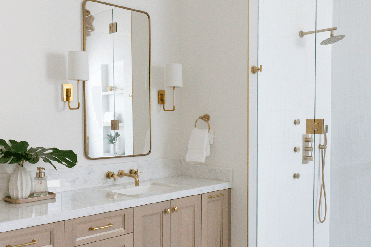
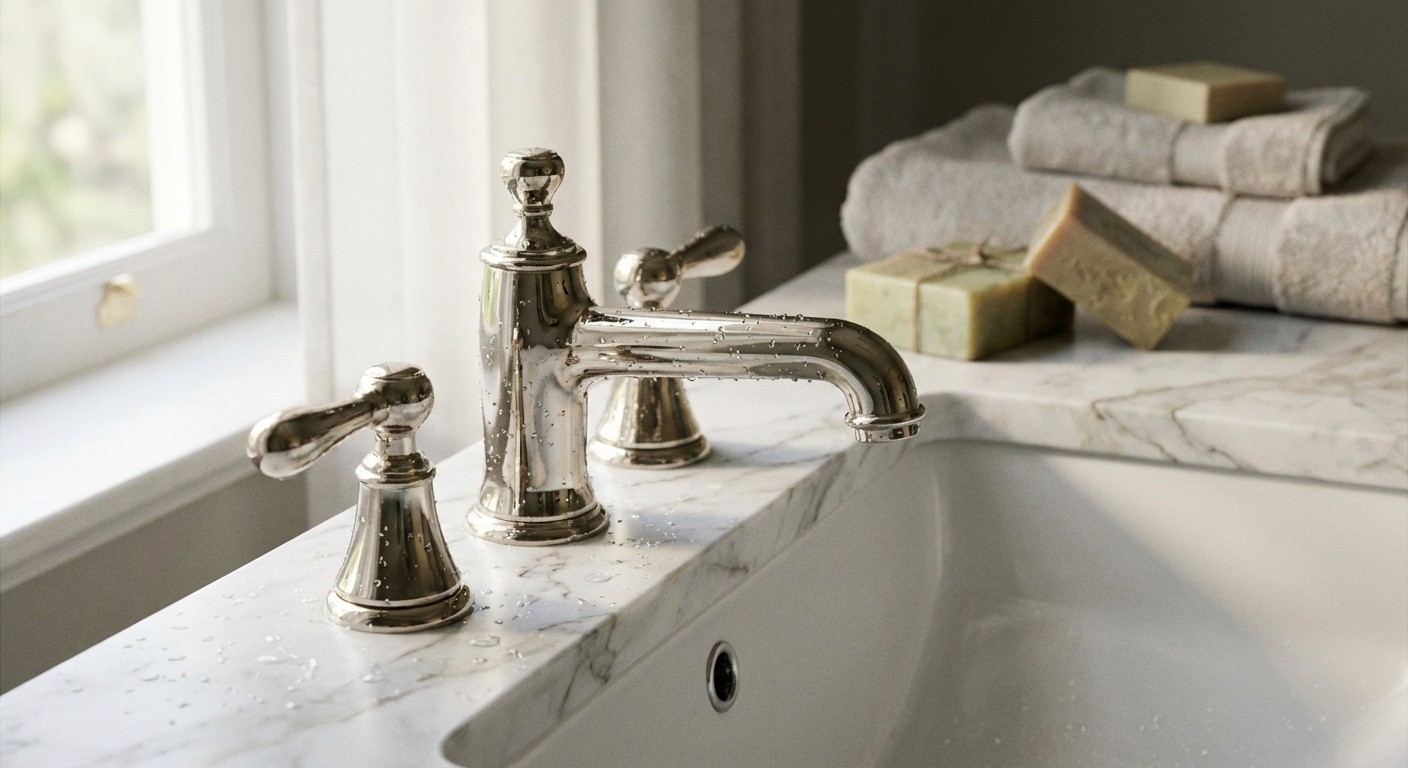
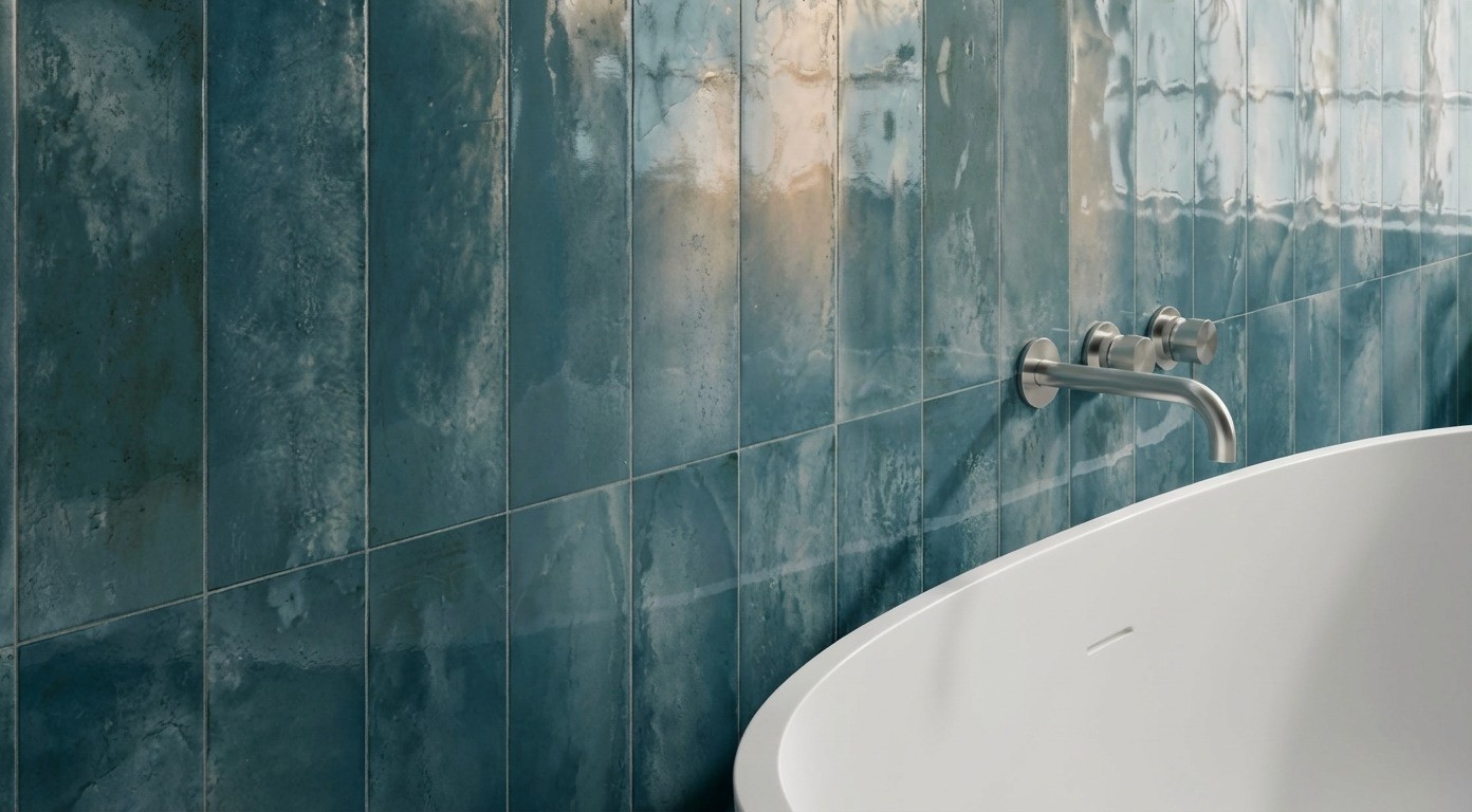
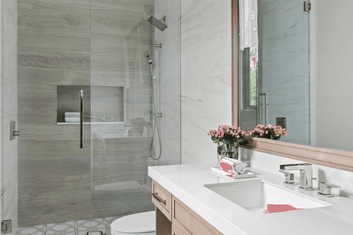
Polished Nickel or Polished Brass Plumbing Fixtures
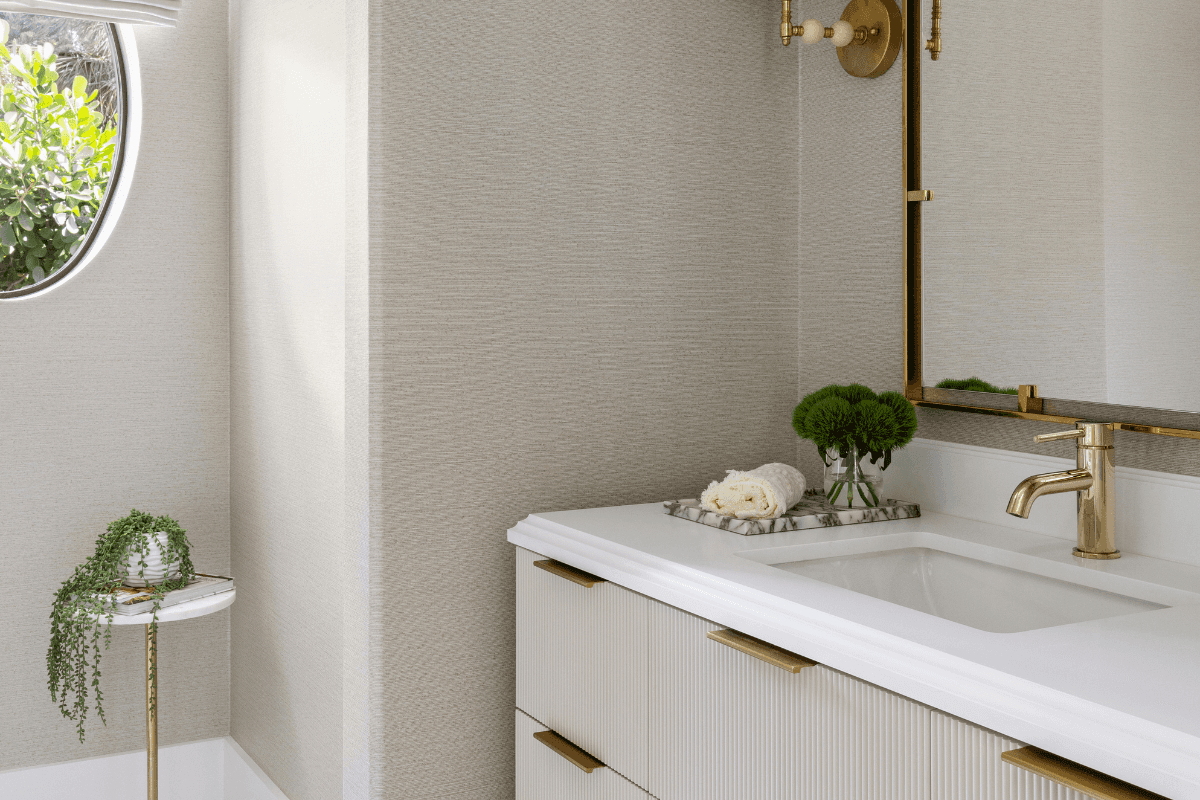
These finishes elevate a bathroom because they do what luxury bathrooms are supposed to do: they control light.
Bathrooms are full of reflective surfaces already, but polished metals add a different kind of reflection. It’s tighter, cleaner, a little jewel-like. And when it’s paired with stone, it reads deliberate.
Why Polished Nickel & Brass Look Expensive
Light Amplification & Contrast
They bounce light around the room and sharpen the edges of the design. Against honed marble or matte tile, that contrast feels intentional rather than industrial.
Warmth and Harmony
Polished brass warms cooler stones like Carrara or Statuario. Polished nickel gives a softer silvery sheen than chrome and often feels calmer against veining.
They Age With The Room
In the right finish, a little patina looks like character, not neglect. That’s a big part of why these metals feel “heirloom” when they’re done well.
Polished Brass vs Unlacquered Brass
They look similar at first. They behave very differently over time.
Polished Brass (Lacquered)
A clear coating locks in the bright shine and helps resist oxidation, tarnish, and fingerprints. It’s great if you want the finish to stay consistent.
Downside – the lacquer can eventually yellow, chip, or peel, especially in steamy bathrooms and with harsh cleaners.
Unlacquered Brass
No coating. It will darken and patina in humidity, with touched areas staying brighter. The result can be beautiful and authentic, but you have to genuinely like the evolution.
If you want the shine back, you polish it. If you want the story, you leave it.
A Simple Way To Choose:
If you want reliable sparkle, go lacquered polished brass.
If you want character over time, go unlacquered.
Maintenance Expectations
You don’t need a ritual, but you do need to avoid the wrong cleaner.
Polished nickel: Wipe with a soft cloth and mild soap or water. Avoid abrasives and anything acidic or bleach-based. In hard water, you may get spotting or haze over time, which can usually be handled with gentle polish when needed.
Polished brass (lacquered): Same approach – soft cloth, pH-neutral soap, dry after use when possible. Avoid oils and harsh scrubbing. If the lacquer fails, it’s usually a professional refinish situation.
Unlacquered brass: Soap and water, and then let it live. Don’t polish unless you want to reset it. Uneven patina is not a flaw, it’s the point.
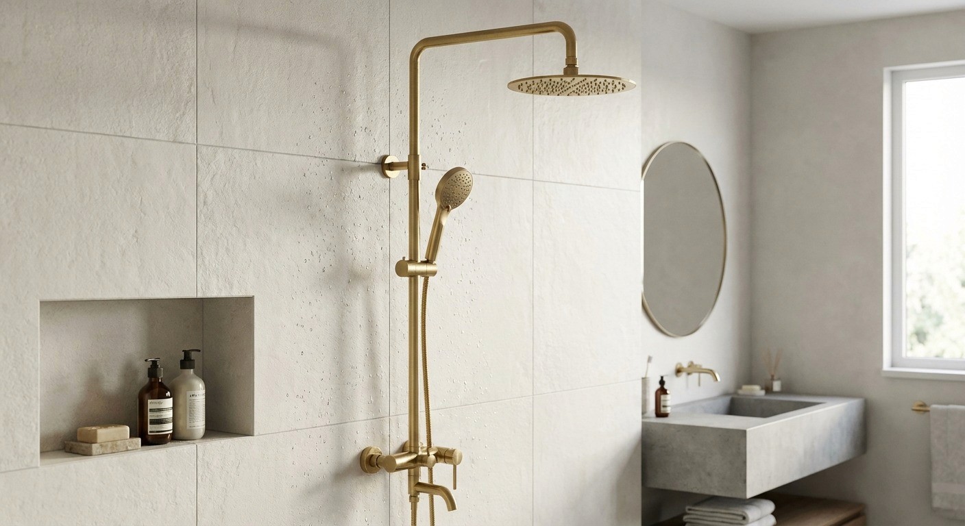
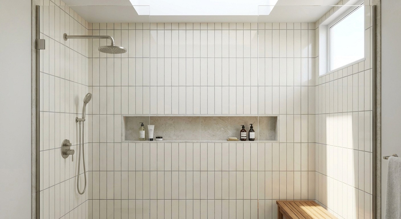
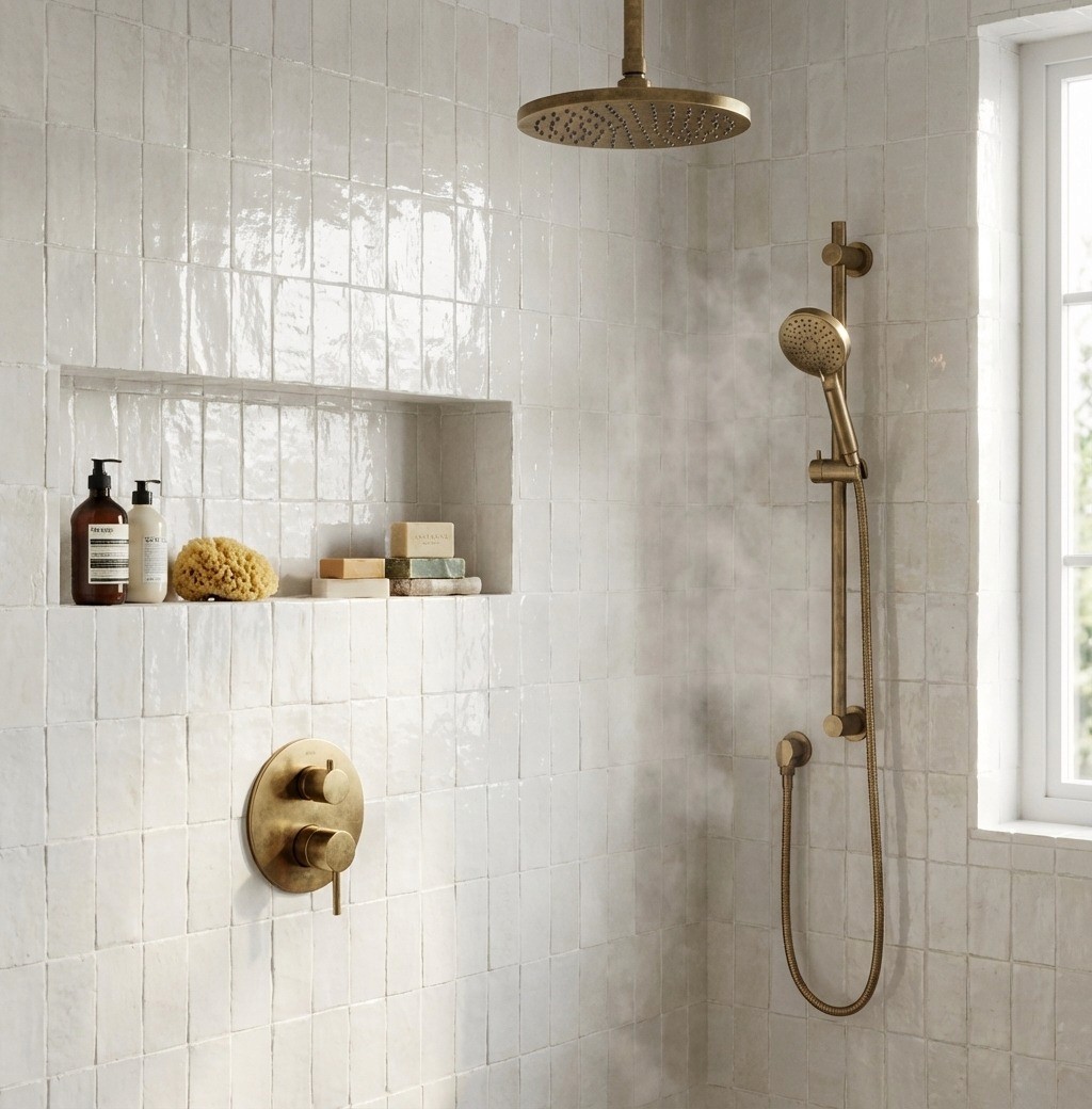
Exposed Pipe Shower Systems
Exposed pipe showers feel architectural because they make the plumbing part of the design.
It’s the same logic as exposed beams or masonry: a bit of honesty, a bit of structure, and a very clear line drawn on the wall.
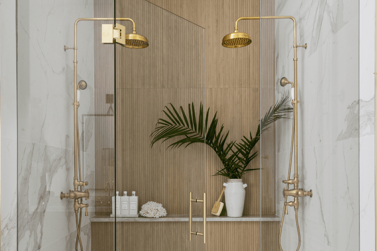
Why They Feel European
Historically, surface-mounted pipework was common in the UK and continental bath design because it was practical and accessible. Modern versions keep that heritage, but with more refined proportions and finishes.
In the right bathroom, the pipes read like a deliberate elevation drawing.
Renovations vs New Builds
Exposed systems are often at their best in renovations.
In older homes, chasing plumbing into walls can mean more demolition, more waterproofing complexity, and more risk. Surface-mounting can reduce disruption and keep future access simpler.
In new builds, concealed valves are easier to plan during framing and waterproofing, so exposed pipework becomes a stylistic choice. It can still look amazing, but it has to be intentional.
How They Change The Wall
Exposed pipework creates a foreground.
If you have a heavy marble field, pipes introduce vertical rhythm that breaks up the mass, like mullions on glass. They add depth too, because the system sits proud of the surface.
The wall becomes background, the fixtures become sculpture.
Alignment & Symmetry Matter More Than Ever
This is not the place to be “close enough.”
Align risers and valves with tile centers or grout joints.
Center the composition: niche, valve, shower head.
Use laser levels.
If it’s even slightly off plumb, it will read off, especially against straight grout lines and shiny metal.
Tile Layout Considerations
Exposed pipework becomes a vertical datum line that the tile pattern needs to acknowledge.
Center the riser on a tile column or grout joint where possible.
Avoid busy diagonals behind the pipework unless the goal is intentionally maximal.
Minimize awkward cutouts and tiny notches around brackets.
In most cases, simpler layouts let the pipework do the talking.
Why Wall Detailing Needs To Be Cleaner
Because nothing is recessed. Everything is visible.
That means flat walls, clean grout lines, minimal lippage, and consistent joints. Exposed systems will amplify any waviness or sloppy termination. When they’re done well, they look like architecture. When they’re not, they look like a retrofit.
Fun Subway Tile Layouts
Subway tile is neutral by nature, which is exactly why layout matters more than the tile.
The same 3x6 rectangle can read classic, modern, playful, or completely custom depending on how it’s set and how it ends.
Common Layouts & What They Do
Running Bond (50% Offset)
Classic, familiar, and forgiving. It adds subtle movement and can make walls feel wider.
Vertical Stack Bond
Crisp and modern. It elongates walls and can make a bathroom feel taller. Great with frameless glass and clean-lined fixtures.
Herringbone
Energy and texture without adding color. Best used as a feature wall or smaller area unless you want the room to feel very active.
33% or 25% Offset
A modern twist on running bond. It feels fresh and can help avoid awkward cuts around penetrations.
Basketweave or Pinwheel
More geometric. Works well as an accent or on floors and low walls when you want a classic pattern without full marble mosaic.
Layout Rules That Keep It Looking Intentional
A few things separate “designer” from “tile contractor did their usual.”
Start from the focal point. Shower valve, niche, vanity, mirror. Dry-lay and center the pattern where the eye lands first.
Avoid tiny cuts at eye level. If the layout ends in slivers at the corner or ceiling line, it will always look off.
Align fixtures with the grid. Especially with exposed pipe showers. When the riser is centered on grout joints and the tile rhythm supports it, everything feels calm.
Use clean termination. Pencil liners, marble trims, or metal edges can make transitions feel finished instead of abrupt.
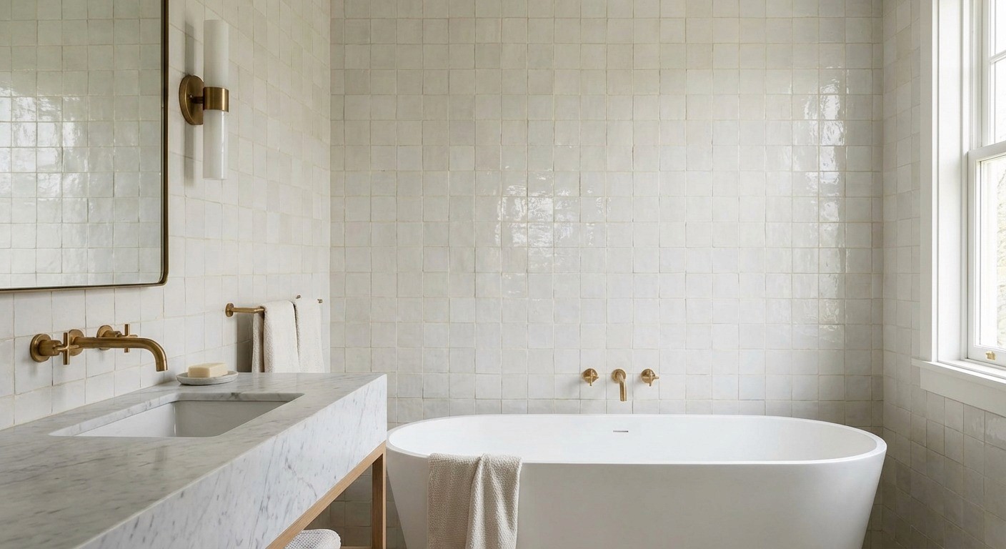
Handmade Zellige tile
Zellige looks luxurious because it’s not perfect.
In a bathroom full of straight lines and flat planes, the variation reads like craft, not inconsistency. And once you see real Zellige next to a factory-made “Zellige look,” it’s hard to unsee the difference.
Why Imperfection Reads As Luxury
Evidence of the hand. Each tile varies slightly in size, thickness, edge, and glaze. That variation signals a human made it and handled it.
Light play. The glossy glaze pools and ripples, catching light at micro-angles. The wall shimmers instead of reflecting flatly.
It signals intention. Because true Zellige is labor-intensive, those imperfections read as curated choice, not defect.
Where It Works Best
Shower walls and niches where steam makes the surface glow
Vanity backsplashes where light hits at an angle
Smaller moments like pony wall caps or thresholds when you want a hint of texture
Zellige can absolutely cover a full wall. But it’s most powerful when it’s used like a jewel box moment, not wallpaper everywhere.
Surface Variation & Glaze Pooling
This is the magic.
Undulating faces, small chips, pinholes, and slightly uneven edges scatter light. Then glaze pooling adds depth, with thicker areas reading richer and thinner areas sparkling more. It’s the opposite of flat, predictable reflection.
Practical note: Tiles should be blended from multiple boxes before install so variation distributes evenly.
Grout Matters More Than You Think
Zellige grout is not an afterthought. It’s the thing that makes the wall look calm or chaotic.
Tight joints mean grout color is very visible.
Too much contrast highlights every irregularity.
Flexible, water-resistant grout matters in steamy showers.
Generally, tonal grouts (ivory, sand, soft grey) let the surface variation shine without turning every edge into a highlighter.
Lighting Changes Everything
Zellige shifts throughout the day.
Morning diffuse light reads soft and airy.
Midday direct light makes it sparkle and intensify.
Evening warm light makes it feel moody and rich.
If you’re specifying Zellige, it’s worth thinking about the bathroom lighting plan early. The tile will respond to it.
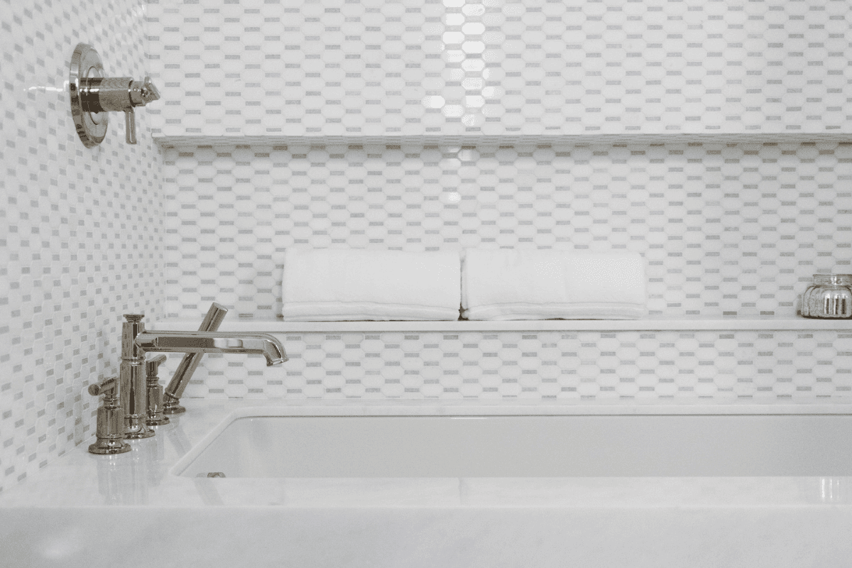
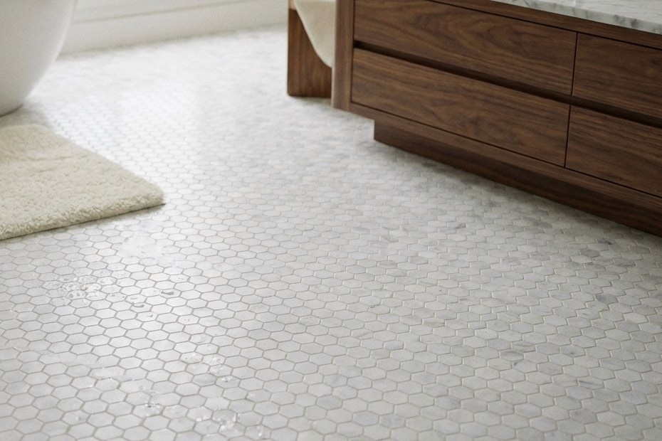
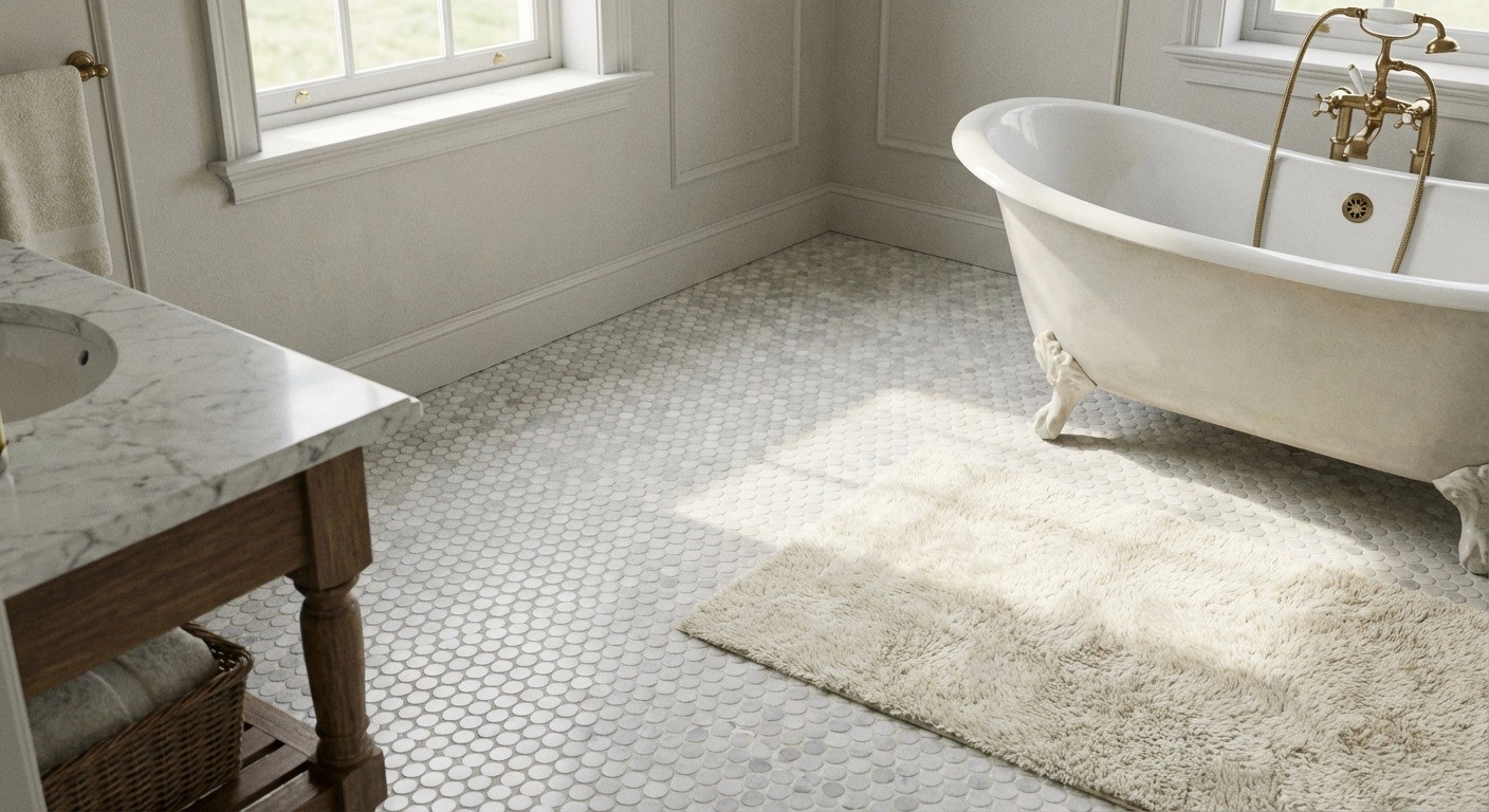
Marble Mosaics
Marble mosaics are one of the easiest ways to add texture without changing the entire material story. They can be classic, graphic, or quiet, depending on scale and grout.
Scale Changes How The Room Feels
Small-Scale Mosaics
Tiny pieces create a dense field that can read more continuous from a distance. They often make small bathrooms feel larger because the floor becomes a subtle texture instead of a loud pattern.
Large-Scale Patterns
Bigger motifs add weight and geometry. They can be beautiful, but they also draw attention to themselves, which can visually shrink a space if everything else is already busy.
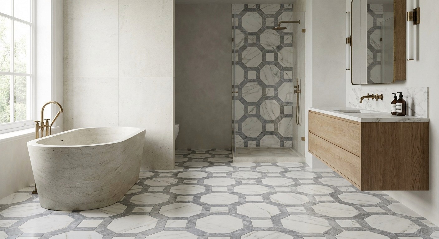
A Simple Rule:
Small scales for full coverage. Larger scales for accents.
Classic Mosaic Patterns
Hex
Timeless and flexible. Small hex can feel quiet; larger hex feels more graphic.
Basketweave
A classic that adds depth and texture, especially with a contrasting dot or tonal grout.
Penny Round
Soft, vintage, and surprisingly elegant. Grout becomes a major part of the look.
Grout Color Makes The Mosaic
Tonal grout blends lines and expands the floor visually.
Contrasting grout outlines every piece and makes the pattern louder.
Mid-tone grout often ages best in wet areas because it hides life.
Transitions Between Slabs & Mosaics
The transition is where many bathrooms lose the plot.
The goal is flow and hierarchy, not a hard stop.
Use mosaics cut from the same marble family when possible.
Consider a pencil liner, a subtle metal strip, or a clean border to define the shift.
Keep alignment intentional so the mosaic doesn’t look like a patch.
Slip Resistance In The Real World
Mosaics can be safer on shower floors because grout lines add traction, but finish still matters.
Honed or textured chips generally perform better underfoot than polished.
Soap residue changes everything. Weekly gentle cleaning keeps traction.
Use mosaics confidently on shower floors with correct slope and drainage planning.
Need Design Advice That Accounts For Construction?
We guide finish decisions with real build constraints in mind.
Frequently Asked Questions
Should I mix polished nickel and polished brass in the same bathroom?
You can, but keep it disciplined: one primary finish, one secondary at most. If both are equally “loud,” the room starts to feel busy fast.
Is marble “high maintenance,” or is that overstated?
It’s not fragile, but it is honest. It will etch and patina with real life, so you either choose finishes that hide it (honed) or commit to gentle upkeep.
How do I keep a luxury bathroom from feeling cold or sterile?
Balance hard surfaces with one warm element: brass, a richer grout tone, softer lighting, or a more tactile tile like Zellige. Warmth is usually a lighting and finish-temperature decision.
What’s the biggest mistake people make with luxury bathroom finishes?
Choosing materials in isolation. The room fails at the seams – mismatched undertones, sloppy terminations, and fixtures that don’t align with the tile grid.
Conclusion
A luxury bathroom is rarely defined by a single showpiece finish.
It’s defined by the decisions that support the room – where you go bold, where you stay quiet, how lines line up, how surfaces terminate, and whether everything was chosen with the build in mind.
If you’re renovating, this is the part most people underestimate. The materials are the fun part. The coordination is what makes them look like they belong.
If you want a bathroom that feels calm, considered, and buildable, the next step is making those decisions with someone who understands both design and construction. Book a free discovery call and we’ll help you define the scope, budget, and details before anything reaches site.


Thinking About a remodel?